Views: 2,566
Welcome to the 2nd lesson of our “Learn Python From Zero For Absolute Beginner” series!
In the previous lesson, you learnt the essential techniques for basic data cleaning and manipulation using Python. Now, get ready to explore the captivating world of data visualization! By the end of this article, you will be able to create this interactive chart.
What you will learn in this article
- Create charts and graphs using Python
- Python Libraries “pygwalker”
- Python Libraries “plotly”
Data source for this tutorial
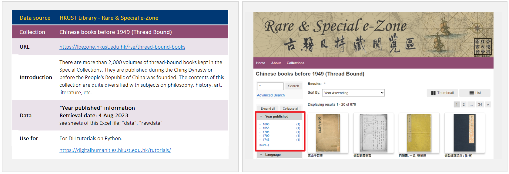
We will be using the same set of data in our previous lesson – the “Year published” data in our “Chinese books before 1949 (Thread Bound)” collection. We also released a completed notebook on Google Colab for this tutorial. Follow along with us!
Data pre-processing
If you have been following along with us in the previous article, you can skip the code of this “Data pre-processing” section and continue using your Colab notebook as we progress further. You can seamlessly transit into this lesson on data visualization.
If you are joining us here for the first time, don’t worry! We’ve got you covered. To catch up with the latest status of the data and ensure you are on the same page, you can simply copy the code provided below. This will bring you up to speed with the necessary data preparation and enable you to proceed with the visualization techniques that we are going to cover.
!pip install pandas
# import sys
# !{sys.executable} -m pip install pandas
import pandas as pd
# change the filepath according to your file location
filepath = '/content/drive/MyDrive/Colab Notebooks/data/data_dh-tutorial_rse-ChiBksBefore1949-ThreadBound.xlsx'
# read data from Excel file
data = pd.read_excel(filepath, sheet_name='data')
# make a copy of the original dataframe "data", and named the copy as "data2"
data2 = data.copy()
# rename column name - from "year published" to "year"
data2.rename(columns={'year published':'year'}, inplace=True)
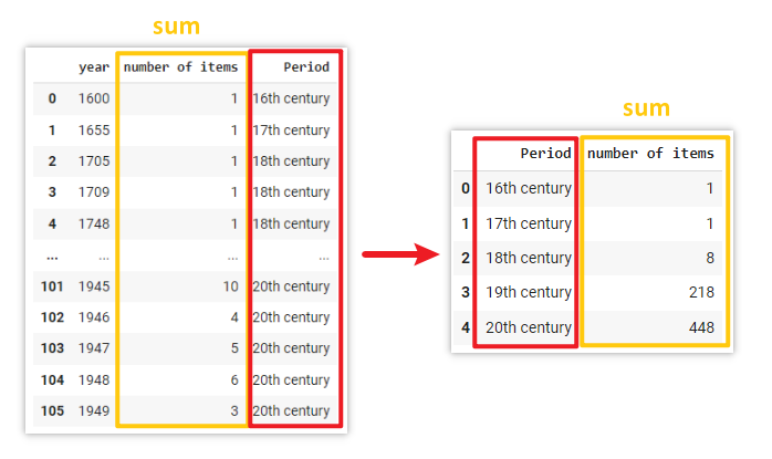
# group the individual years into broader time periods
data2['Period'] = ['16th century' if 1501 <= year <= 1600 else '17th century' if 1601 <= year <= 1700 else '18th century' if 1701 <= year <= 1800 else '19th century' if 1801 <= year <= 1900 else '20th century' if 1901 <= year <= 2000 else "Ungrouped" for year in data2['year']]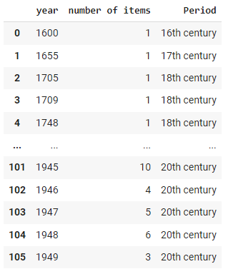
Data Visualization
When it comes to chart visualization in Python, there is a wide range of libraries available to choose from, such as Matplotlib, Seaborn, Plotly, etc. Each offers its own strengths and capabilities. For the purpose of this article, we have carefully selected two libraries that strike a balance between ease of use and aesthetic appeal – they are PyGWalker and Plotly. We aim to provide you with the necessary tools to craft visually appealing charts while ensuring a smooth learning curve. Without further ado, let’s dive in and discover the power and beauty of these two selected libraries!
Use PyGWalker to create charts by simply drag-and-drop
Documentation: https://docs.kanaries.net/pygwalker
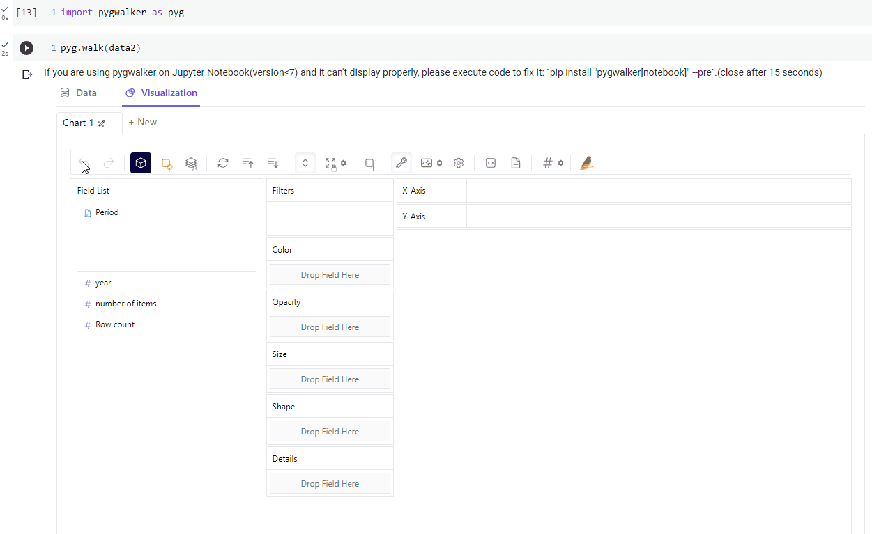
According to its official documentation, PyGWalker (pronounced like “Pig Walker”, just for fun) is named as an abbreviation of “Python binding of Graphic Walker“. It can turn pandas DataFrame into a Tableau-style User Interface for visual exploration, greatly simplify the workflow of data analysis and visualization in Jupyter Notebook.
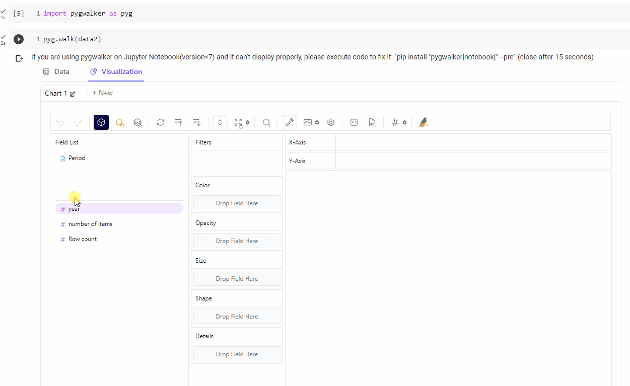
To do so, just import the library and use a single line of code
import pygwalker as pyg
pyg.walk(data2)
Measures & Dimensions
In the context of data analysis, measures and dimensions are fundamental concepts that help organize and understand data fields.
Measures
It is also known as metrics or quantitative variables, represent the numerical values or quantitative aspects of the data. They typically correspond to the numeric or continuous data fields in a dataset. Measures are used to perform calculations, aggregations, and mathematical operations.
Dimensions
It provides the context or descriptive characteristics of the data. Dimensions categorize or group the data into distinct categories or levels.
The table below illustrates the common classification of data:
| Discrete data (no between values) |
Continuous data (have values between) |
|
|---|---|---|
| Ordered data (values are comparable) |
Ordinal data e.g. size: S,M,L ; count: 1,2,3 |
Fields data e.g. altitude, temperature |
| Unordered data (values not comparable) |
Nominal data e.g. categorical data such as shape: circle, square, triangle |
Cyclic data e.g. directions: North, East, South., West; Color hues |
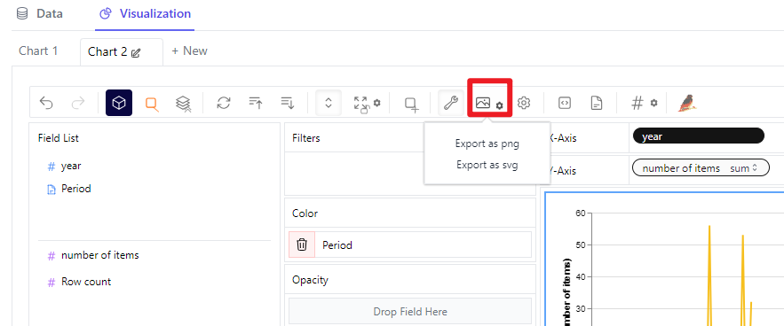
In PyGWalker, you can easily change the data type of each column in the dataset by clicking the “Data” tab.
Changing the chart type is as simple as clicking a single button, as illustrated in the screenshot below.
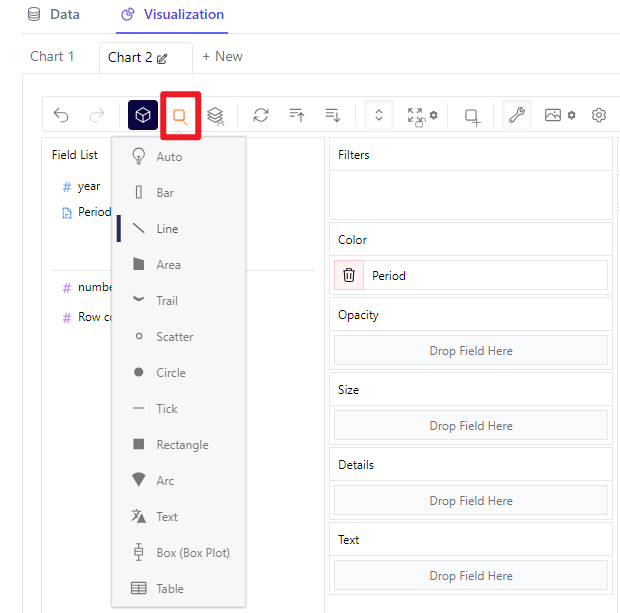
You can also export your generated chart as PNG or SVG.
However, it’s important to note that the charts generated using PyGWalker in the Jupyter Notebook will not be automatically saved within the notebook itself by default. As a result, PyGWalker is primarily suited for data exploration purposes, allowing you to quickly visualize and analyze data without the need to save the charts in the notebook for future reference.
If you require more advanced capabilities for data visualization, we highly recommend you to use Plotly, which we are going to introduce and demonstrate its capabilities to you right away.
Use Plotly to create interactive charts
Documentation: https://plotly.com/python/
Plotly offers a wide range of features that make it an excellent choice for data visualization tasks. It provides extensive customization options, allowing you to tailor the appearance and style of your charts to suit your specific needs. Moreover, Plotly offers interactive features, enabling you to create dynamic and engaging visualizations that can be easily shared and explored. With its power and flexibility, you can take your data visualization to the next level.
Before getting started, make sure to install and import the library.
!pip install plotly
import plotly.express as px
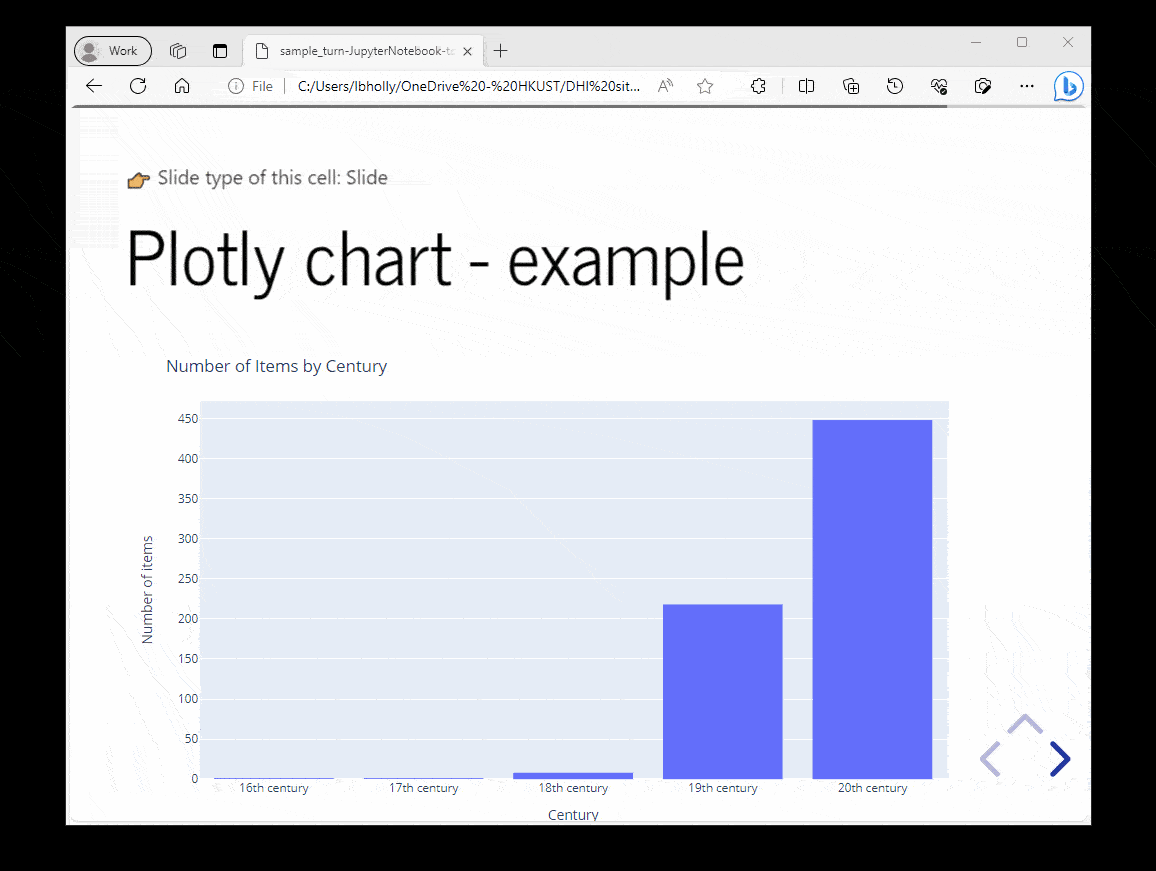
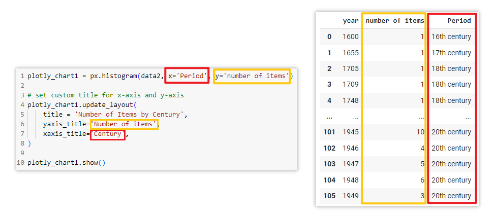
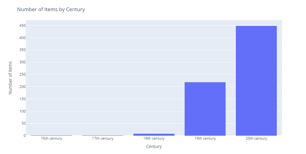
Example of using plotly to create histogram:
# Create a histogram chart named "plotly_chart1"
# Use "data2" DataFrame as data source
# x-axis: use "Period" column
# y-axis: use "number of items" column
plotly_chart1 = px.histogram(data2, x='Period', y='number of items')

# Update chart layout
plotly_chart1.update_layout(
    title = 'Number of Items by Century', # set the title of the chart
    yaxis_title='Number of items',        # set the title of y-axis
    xaxis_title='Century',                # set the title of x-axis
)

# Show the chart
plotly_chart1.show()
Documentation: https://plotly.com/python/histograms/
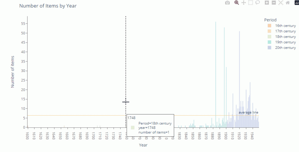
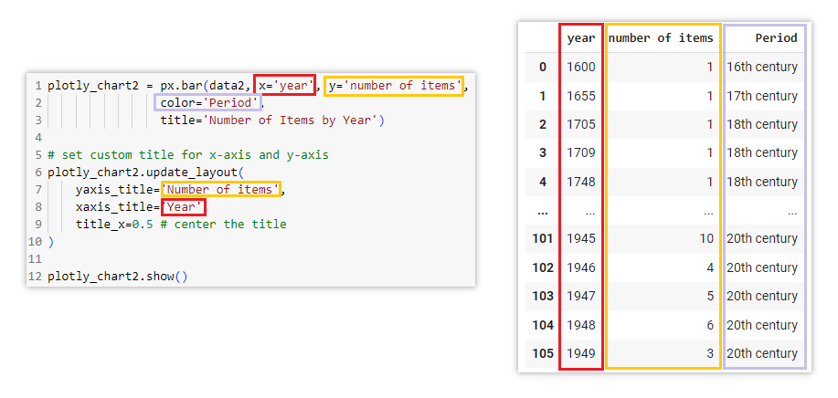
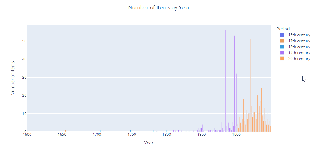
Example of using plotly to create bar chart:
# Create a bar chart named "plotly_chart2"
# Use "data2" DataFrame as data source
# x-axis: use "year" column
# y-axis: use "number of items" column
plotly_chart2 = px.bar(data2, x='year', y='number of items',
                color='Period',
                title='Number of Items by Year')

# Update chart layout
plotly_chart2.update_layout(
    yaxis_title='Number of items',   # set the title of y-axis
    xaxis_title='Year',              # set the title of x-axis
    title_x=0.5                      # center the title
)

# Show the chart
plotly_chart2.show()
Documentation: https://plotly.com/python/bar-charts/
As mentioned earlier, Plotly offers a remarkable degree of customization, allowing you to tailor your charts precisely to your preferences. With Plotly, you have the flexibility to adjust various aspects of the chart’s appearance, such as colors, fonts, labels, annotations, etc.
Additionally, Plotly provides advanced interactive features, enabling you to add hover effects, zooming, panning, and tooltips to enhance the user experience. These interactive elements make it easier for viewers to explore and understand the data presented in the chart.
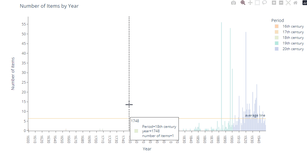
In the example below, we customized the bar color and background color, added hover effects, and added a line showing the average level.
While customizing the color, you may refer to this website to get the color code: https://htmlcolorcodes.com/
# Create a bar chart named "plotly_chart3"
# Use "data2" DataFrame as data source
# x-axis: use "year" column
# y-axis: use "number of items" column
plotly_chart3 = px.bar(data2, x='year', y='number of items',
                color='Period', # use 'Period' column as the color category
                color_discrete_sequence=["#ffb7b2", "#ffdac0", "#e3f0cb", "#b5ead9", "#c7cee9"]) # set custom color for each bar based on "Period"

# Update chart layout
plotly_chart3.update_layout(
    title = 'Number of Items by Year', # set the title of the chart
    yaxis_title='Number of items',     # set the title of y-axis
    xaxis_title='Year',                # set the title of x-axis
    paper_bgcolor = 'white',           # set background color of the entire figure as white
    plot_bgcolor = 'white',            # set background color inside the axes as white

    # Customize x-axis properties
    xaxis = dict(
        showline = True,                        # show axis line
        linecolor = 'rgb(102, 102, 102)',       # set axis line color
        tickfont_color = 'rgb(102, 102, 102)',  # set color of tick labels
        showticklabels = True,                  # show tick labels
        dtick = 10,  # set interval of each tick in x-axis (in this case: 1600, 1610, 1620, etc.)
        ticks = 'outside',                # place ticks outside the axes
        tickcolor = 'rgb(102, 102, 102)', # set tick color
    ),
     # Customize y-axis properties
     yaxis = dict(
        showline = True,                        # show axis line
        linecolor = 'rgb(102, 102, 102)',       # set axis line color
        tickfont_color = 'rgb(102, 102, 102)',  # set color of tick labels
        showticklabels = True,                  # show tick labels
        dtick = 5,  # set interval of each tick in y-axis (in this case: 0, 5, 10, 15, etc.)
        ticks = 'outside',                # place ticks outside the axes
        tickcolor = 'rgb(102, 102, 102)', # set tick color
    ),
)

# Add a horizontal line representing the average value of "number of items"
plotly_chart3.add_hline(y = data2['number of items'].mean(), annotation_text = 'average line', line_width = 1, line_color = '#edc982')

# Add interactive hover feature - show line when hovering
plotly_chart3.update_layout(hovermode='x unified')

# Show the chart
plotly_chart3.show()
With Plotly, you can even bring your data to life by animating your charts and visualizations! We encourage you to dive into Plotly’s documentation and examples to explore the full potential of Plotly and unleash your creativity in data visualization.
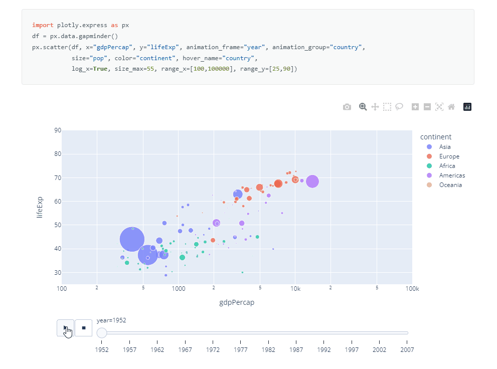
Screenshot from https://plotly.com/python/animations/ on 2023.08.25
Learn more
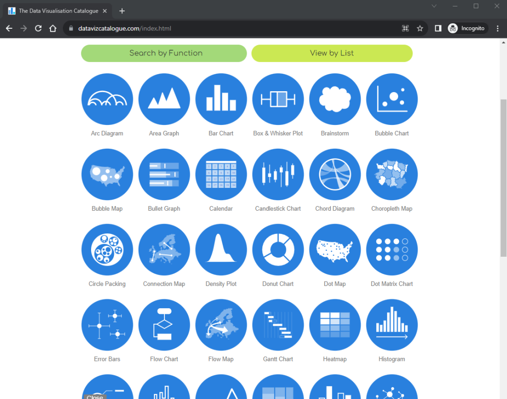
If you’re uncertain about which types of charts to utilize for your data visualization needs, we recommend you to visit this website https://datavizcatalogue.com/
This website provides a comprehensive catalog of various data visualization techniques and charts. You can learn about different chart types such as bar charts, line graphs, scatterplots, pie charts, and many more. Each chart is accompanied by a brief description and examples of its application, allowing you to gain a better understanding of when and how to use each chart effectively.
Conclusion
We trust that you now have a clearer understanding of how Python can be utilized for data visualization. However, there is still much more to explore and discover in the realm of visualization. We encourage you to dive deeper into the documentation, tutorials, and examples available online to expand your knowledge and skills. By actively exploring and experimenting with Python’s visualization capabilities, you can unlock new ways to present and analyze data, ultimately enhancing your ability to derive meaningful insights and communicate information effectively. Seize the opportunity and embark on your own exploration of Python visualization to unleash its full potential!
You may download or save a copy of our completed notebook on Google Colab. It consolidated all the code mentioned throughout this article.

Next article – Create Website
In our upcoming article, we are excited to guide you through the process of building a website using Python with just a few lines of code. We understand the importance of sharing your visualizations with a wider audience, and what better way to do so than by showcasing them on a website?
We will walk you through the steps of creating a simple yet powerful website that will allow you to display and share the visualizations you have created. Stay tuned for our next article, where we will empower you to take your Python visualizations to the web!
– By Holly Chan, Library
August 25, 2023
You may also be interested in…